Connecting Your Brand's Visual Identity to an AI Photo Booth Experience
Why visual identity matters in photo activations
When a company invests in an AI photo booth for an event, the goal is rarely just entertainment. Most teams want guests to walk away with a memorable impression that reinforces the brand's look and feel. A generic photo strip with no connection to your colors, typography, or mood misses that opportunity. By intentionally linking the AI photo booth experience to your visual identity, you create a consistent touchpoint that feels intentional rather than slapped on. This article walks through the practical steps to make that connection work, whether you are planning a conference booth, a campus activation, or a holiday party.
Step one: define your brand's visual anchors before the event
Before you talk to any vendor or look at software settings, sit down with your brand guidelines. Pull out the primary color hex codes, the approved logo variations, and any secondary graphic elements like patterns or icons. The AI photo booth experience should not invent a new visual language for your brand; it should extend what already exists. If your brand uses a specific shade of blue across all marketing, that same blue should appear on the photo overlay, the background, and the digital delivery template. Consistency across physical and digital touchpoints builds recognition.
Also consider the mood your visuals communicate. A law firm's holiday activation might want clean, minimal frames with a subtle gold accent. A university recruitment event might lean into bright school colors and a playful illustration style. The AI system can apply these elements, but only if you supply them clearly upfront. Write down the non-negotiables: which colors must appear, which logo lockup to use, and which fonts are approved. This document becomes your creative brief for the activation.
What to watch for
Beware of letting the AI system's default templates dictate your look. Many platforms offer pre-made designs that are easy but generic. If the default has a different color temperature or font family, guests will associate that look with your brand, not the AI booth. Insist on custom templates that match your guidelines exactly. Also watch for color shifts between screen previews and printed output. Test a sample print or digital image under event lighting to confirm the colors read correctly.
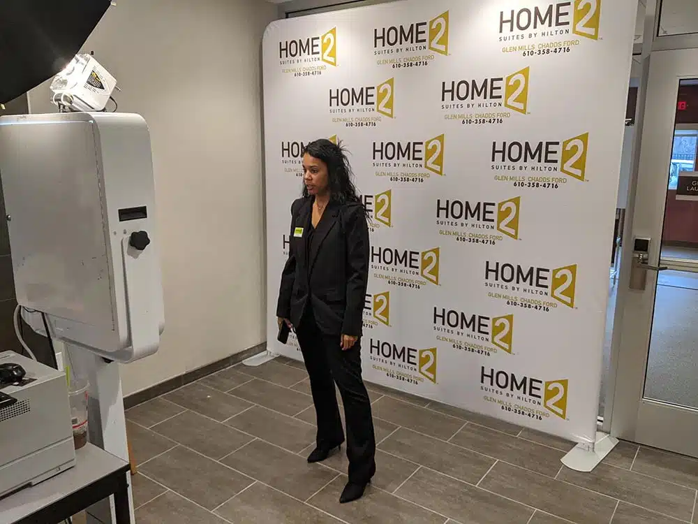
Step two: align the AI prompts with your visual style
Modern AI photo booths use custom prompts to generate background scenes, filters, and even composite images. If your brand has a consistent aesthetic, the prompts should reflect that. For example, if your brand uses flat illustration with bold outlines, the prompt might specify “flat vector style with thick black outlines and solid fills.” If your brand leans photographic with warm tones, the prompt should describe “natural light, warm golden hour look, shallow depth of field.” This is where the connection between the AI photo booth experience and your visual identity becomes most direct.
Work with the activation provider to write three to five prompts that cover the main use cases: a solo portrait, a group shot, and maybe a themed background for the event. Each prompt should include your brand's color palette as a reference. Do not assume the AI will guess your style from a single word like “corporate.” The more specific you are about visual qualities, the more consistent the output will be across hundreds of guests.
What to watch for
AI prompt interpretation can vary across systems. What one model calls “minimalist” another might render as flat. Run a test session with a small group before the main event. Look at the generated images and ask whether they feel like your brand. If the AI introduces random elements like unnecessary textures or off-brand props, adjust the prompt language. Also watch for the AI’s tendency to default to a “stock photo” aesthetic that is clean but forgettable. Your prompts should push toward your specific look, not a generic polished image.
Step three: design the overlay and digital delivery template
The photo itself is only half the experience. Most AI photo booths offer a digital delivery option: guests receive the image via text message, email, or a QR code link. That delivery template is prime real estate for reinforcing your visual identity. The overlay should include your logo in a consistent position, the event name or date if relevant, and a color treatment that matches your brand palette. Some providers let you add a custom border or a subtle watermark that feels like a design element rather than an ad.
Think about the aspect ratio and layout too. If your brand uses a specific grid or margin system, apply that to the photo frame. For social sharing, the template might include a small handle or hashtag, but keep it unobtrusive. The goal is that when a guest posts the photo to their own feed, the image looks like a natural part of your brand ecosystem, not a random add-on. Digital delivery also lets you include a call to action without breaking the visual flow. A simple line like “Scan to learn more” can sit inside the overlay if the font and placement match your style.
What to watch for
Do not overcrowd the overlay. Too many logos, URLs, or decorative elements make the photo feel cluttered and reduce the chance guests will share it. One logo lockup and one subtle graphic element are usually enough. Also check how the overlay renders on different screen sizes. A photo that looks balanced on a desktop monitor might crowd the frame on a phone. Test the delivery template on at least two devices before the event.

Step four: plan the guest consent and sharing flow
Guest consent is a practical and legal requirement that also affects visual consistency. When a guest agrees to have their photo taken and shared, the sign-up or opt-in screen should use the same brand colors and typography as the rest of the activation. A jarring shift to a generic consent form breaks the visual identity you have worked to build. Work with the provider to skin the consent screen with your brand elements, even if that means a simple color bar and your logo in the corner.
After consent, the image sharing flow should feel seamless. If guests scan a QR code to download their photo, the landing page should match the event’s look. Many providers offer a white-label gallery page where you can upload your brand assets. Use that option. A mismatched or unbranded gallery page reminds guests that the experience is a rented service rather than a branded moment. The same principle applies to any email confirmation that includes the photo: the email template should carry your logo and colors.
What to watch for
Privacy regulations vary by location and event type. Make sure the consent language is clear and that guests can opt out without friction. From a visual standpoint, the consent screen should not feel like a wall of text. Use your brand’s typographic hierarchy to make the options easy to read. Also watch for auto-play or auto-share settings that send images without explicit permission. A guest who feels their image was used without consent will associate that discomfort with your brand, not the booth provider.
Step five: test the full flow before the event
A full walkthrough of the AI photo booth experience from start to finish reveals gaps that individual component checks miss. Recruit a small group of colleagues or friends to simulate guest behavior. Have them scan the QR code, take a photo, review the overlay, consent or decline sharing, and receive the digital image. Note where the visual identity feels strong and where it weakens. Does the background color shift between the preview screen and the printed strip? Does the logo appear correctly on all output formats? Is the font rendering crisp at different sizes?
This test also catches timing issues. Some AI systems generate images with a slight delay. If the loading screen shows a generic spinner or a default brand color that does not match yours, ask the provider to customize that intermediate state. Every moment a guest looks at a screen is a moment your brand is on display. Make sure each state, from the start screen to the final download link, carries your visual DNA.
What to watch for
Do not skip testing with real lighting conditions. Event lighting can affect how the AI interprets skin tones and background colors. If the booth uses a green screen or a generative background, test it under the actual lighting of the venue. Also test the print quality if you are offering physical copies. A print that looks washed out or misaligned undermines the polished identity you have built. Finally, confirm that the digital delivery images are high resolution enough for social sharing. A pixelated logo on a guest’s Instagram story does more harm than good.
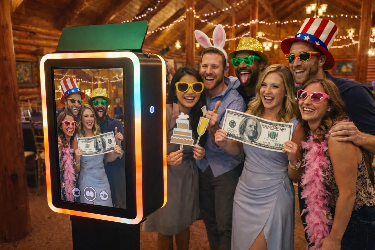
Bringing together all these elements is what separates a generic photo station from a meaningful brand extension. When the colors, prompts, overlays, consent screens, and delivery templates all speak the same visual language, the activation feels cohesive. Guests notice the attention to detail, and the resulting shared images become authentic endorsements of your brand’s style. For event planners and marketing teams, this level of integration turns a one-time activity into a lasting impression. The same approach applies whether you are running corporate photo booth activations for a large conference or a small employee gathering. Each activation is a chance to reinforce what makes your brand visually distinct.
At the end of the day, the success of an AI photo booth experience depends less on the novelty of the technology and more on how well it fits into your broader visual strategy. A consistent look builds trust. A thoughtful overlay encourages sharing. A seamless digital delivery keeps the brand top of mind after the event ends. By following these five steps and paying attention to the details at each stage, you can connect your AI photo booth experience directly to your company’s visual identity in a way that feels natural, intentional, and effective. For anyone planning corporate photo booth activations in the near future, aligning the visual identity upfront saves time and delivers a better guest experience.